All but the final touches are complete for a new exhibition in the Woodson Art Museum south galleries. The process began well over a year ago during an Art 101 program.

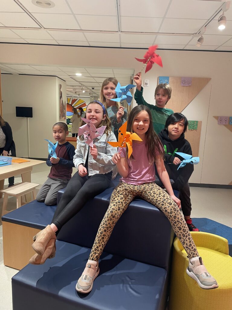
In answer to frequent visitor inquiries about how exhibitions are organized, I designed an Art 101 program sharing how, as a curator, I choose works from the permanent collection – those artworks residing at the Museum in perpetuity – for gallery installations.
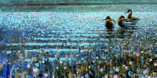
The Museum’s collection numbers in the thousands. To streamline my demonstration of the selection process, I made some preliminary decisions. One was using water as the theme; I thought it broad enough to guide, but not hamper, choices. Next, I gathered images of paintings, graphics, and sculpture focused on rivers, lakes, oceans, and seas.
For the first round during Art 101, more than one hundred images were considered. Participants included ten women and men who discussed, compared, and contrasted each artwork. The process was not unlike American Idol or Dancing with the Stars. The participants served as judges, and several rounds of voting ensued, narrowing the field to the final goal of fifty artworks.
Once the final inventory is complete, it’s time to choose a fitting title. That’s not always easy. In a few words, you want to convey the exhibition premise and pique interest to prompt visits. After many, many ideas, Shoreline Symphony was chosen. Writing the exhibition labels and a panel summarizing the thesis combines the ideas and images into a cohesive package.
One of the most rewarding and exciting steps is selecting a complementary gallery wall color, a task that also can be daunting. The Art 101 group consensus was blue – but which tone? There are dozens of variations from navy blue to snowdrop. I was inclined to choose a lighter tone of blue. I felt the shade should evoke light and calm; objective achieved. I hope you’ll agree.
 The final phase is installing artworks. Some works get moved a dozen times before they’re suitably partnered, the scale and aesthetics is spot on, and the flow of color and shape is ideal. The true test comes with the first comments as my coworkers enter the galleries.
I’m happy when I stand back, scan the walls, and decide that’s my favorite. No wait, that’s my favorite! Oh, they are all my favorites.
What’s your favorite Shoreline Symphony artwork?