
Allison Buchli, graphic designer and multimedia specialist & Bryce Cebula, marketing and communication manager
When I started working at the Museum in summer 2025, Birds in Art Fifty was just around the corner. The final details of the opening weekend were getting squared away, the catalogue was on its last round of edits, and I had just enough time to receive a crash course on everything Birds in Art. Those couple of days were a whirlwind to say the least, but they also left me feeling excited for future years, and eager to play more of a role in all that goes into preparing for such a meaningful event.
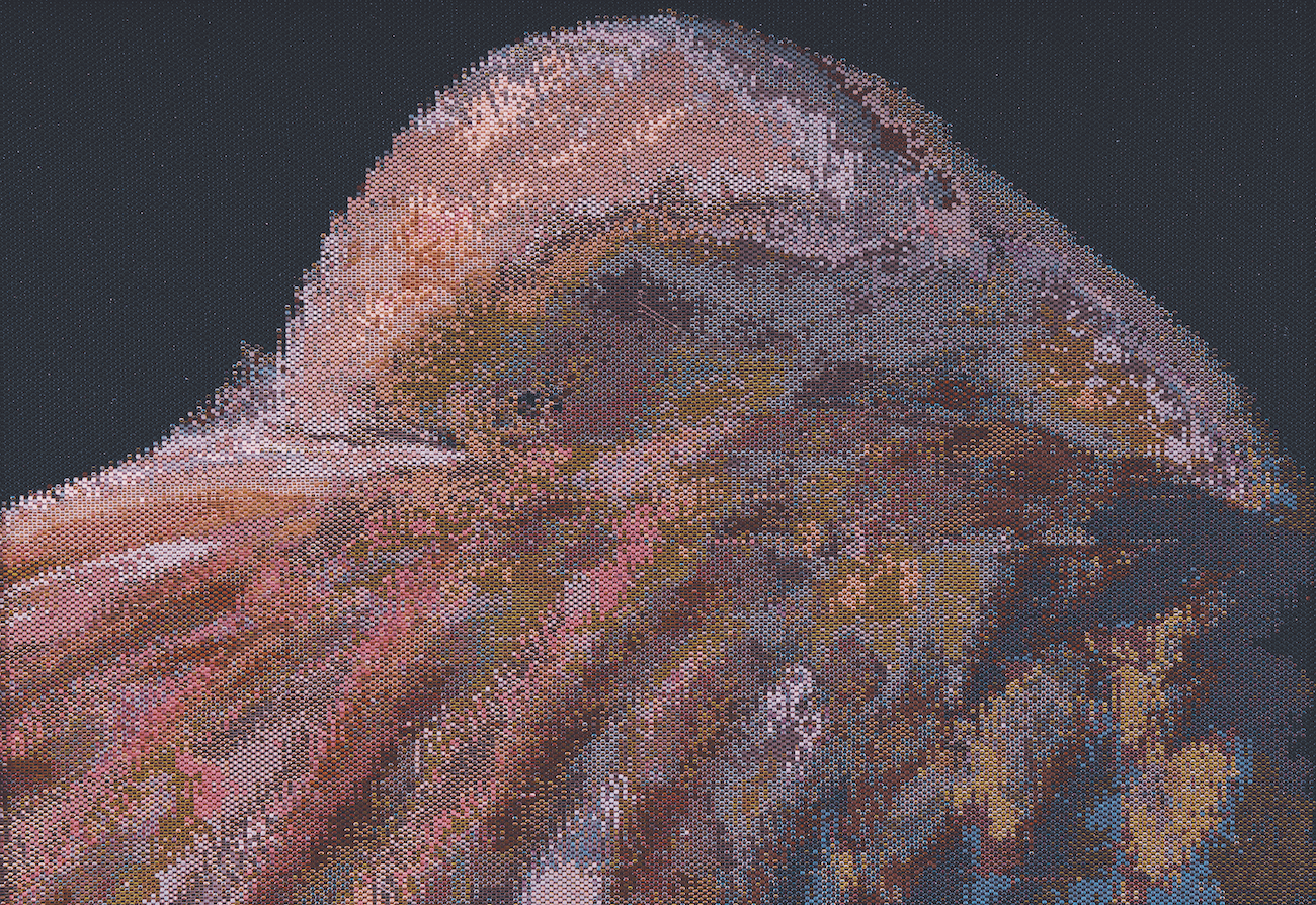
Fast forward nine months, and the Birds in Art jury’s final selections for the 2026 exhibition are printed out on sheets of paper and displayed across a large table. It’s the Museum staff’s first time seeing all of what will adorn the gallery walls in just a few short months. It’s a sea of color, shape, and of course…birds! Knowing that one of my responsibilities as the Museum’s Graphic Designer and Multimedia Specialist would be designing the front cover of the Birds in Art catalogue, I couldn’t help but have that perspective as I was taking in each artwork. When I got to Corinne McAuley’s Waving Flamingo, inspiration struck. Not only did the beautiful swaths of color created by thousands of glass beads catch my eye, but the tactile curiosity of the work, and how that could lend itself to an interactive cover experience were intriguing too.
Corinne McAuley, Waving Flamingo, 2024, glass beads
As any good graphic designer would do, I spent the next couple of weeks working up several catalogue cover concepts. In my opinion, all of the artworks selected for the exhibition are cover-worthy, but we had to select just one. After plenty of conversation between myself and several other Museum staff, we chose Waving Flamingo.
To follow through with my vision for the cover having a tactile aspect to it, we spoke with Reindl Printing, out of Merrill, Wisconsin, to learn what was possible. After feeling some samples, we decided that a raised, soft touch UV coating would allow us to give people a taste of the texture one would expect to feel if they could touch Corinne’s artwork.
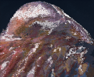
The “map” Allison made to show where she wanted the UV coating placed
The next step was mapping out the exact placement of each tactile “bead” that we wanted on the cover. This was a tedious process, but rewarding once I saw and felt the final product. To put it simply, I brought the image of the artwork into Adobe Illustrator, created a flat shape that mimicked the Delica beads Corinne uses in her work, and placed them overtop the individual beads in the image so that when the coating was printed, it lined up with the artwork. We decided as a staff not to cover the entire cover in the raised UV coating, as we wanted it to be subtle, yet still noticeable when felt. When deciding which areas of the cover I wanted the “beads” to come through versus the areas left flat, the ability to see and experience the artwork when it arrived to the Museum about a month and half before the opening of the exhibition helped determine this. Due to the iridescence of many of the beads Corinne uses, how they interact with light and movement can unlock new and unique viewing experiences with the artwork. This helped determine which areas I wanted to be highlighted.
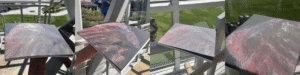
The final product at different angles to show the UV coating placement
Let me jump in, Allison. Another important detail in creating the catalogue is designing the fly sheet, which is a standalone paper that sits between the cover and the main pages of a book. For the past several years, the fly sheet has been inspired by the cover artwork, related to either the artwork itself or the medium used by the artist. Because the use of beads is such a unique medium for the exhibition, it posed an exciting challenge for creating the fly sheet.
Allison and I share an office, so we spend a lot of time bouncing ideas off each other during the day. We mulled over many ways to make the fly sheet feel fresh yet connect to the cover, eventually coming back to the idea that every viewer experiences the artwork differently depending on how and where they look at it. The team ultimately decided to use a transparent, lightweight sheet that could hold up to printing a detailed, macro shot of the beadwork with the Birds in Art 2026 logo peeking through.
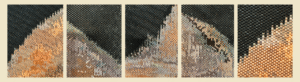
A small selection of the photos Allison and Bryce took for their original fly sheet idea
The next step in the process was to photograph the artwork! We set up a station where we took photos of the artwork using different lighting, lenses, and cameras. After many failed attempts to produce the image we needed for the page design, we decided to pivot; it was time to get video involved.
Initially, the hope was that we would be able to get a clearer shot of a section of the beads by taking a video panning over the artwork, and from there, we could take a screen grab of the frame that worked best for us. After going through the video, we realized that our idea was not going to work, but something else caught our attention. We noticed that the movement of the video showcased the unique ways in which the beads and light interacted. Some frames were crisp and bright with pink and orange hues framing the flamingo figure; some presented a variety of jewel tones in an array of hazy rounded shapes. There were even a few blurry frames that marbled many colors together to create an image that resembled an abstract watercolor painting. Allison and I both knew that we just uncovered the answer we were looking for.
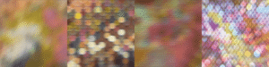
Some of the favorite frames taken from the panning video
We narrowed down the frames and presented them to the rest of the team. It was clear in the conversation that we weren’t going to pick just one. . . so why not pick three? We circled back to the idea of the viewers’ experience. With Corinne’s artwork, what we saw under studio lighting during photography was much different than what visitors are seeing in the galleries because of the iridescence of the beads. That idea had to be captured in the catalogue somehow. Thus, the idea of having three different fly sheets was born.
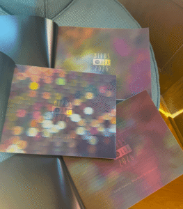
Thank you, Bryce! Once we settled on our three fly sheet designs and the texture mapping was complete, we sent it off to Reindl, who beautifully produced the catalogue you hopefully have in your possession today! While we recommend visiting the Museum to view Birds in Art 2026 for yourself, we hope the catalogue provides just as much of an immersive experience.
The Birds in Art 2026 catalogue, along with posters and stickers, can be purchased at the Museum or online here.
Want to receive Woodson Wanderings directly to your email inbox? Sign up for our blog emailing list today!