
 It’s Birds in Art catalogue time. As part of the ambitious production team, I began the first of my responsibilities yesterday.
For the most part, artists supply the required high-quality digital images reproduced in the catalogue. As a courtesy to those who don’t have access to a qualified photographer, the Museum offers the option to have the works photographed here. For the past five years, Phillip Harsh from The Studio has used his finely honed skills to produce the perfect likeness of each work. This may sound easy as most of us have mastered our point-and-shoot cameras, but artworks offer an entirely different challenge.
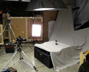
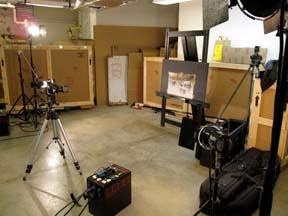
 Phillip arrives early morning with a van load of equipment – enough to handle any potential problems – and promptly begins the hour-long setup.
 While Phillip organizes the equipment, I carefully unframe the paintings. It’s easier to achieve accurate color sans frame and glass thereby reducing glare and shadows. I also double check that sculptures are lint-free.
 Sculptures are first up. A large piece of fabric that serves as a neutral background is draped across a table and six feet up behind the table, creating a stage-like setting. Lights are placed all around, the camera and computer readied. After all these preparations, the first sculpture is carefully positioned, numerous test shots taken, and lights and apertures adjusted. Philip and I assess each image as it appears on the computer screen – sometimes as many as ten for each artwork –
  until we’re confident we’ve achieved the most accurate rendering.
Paintings are a bit easier. The lights are placed at the proper angles to the easel and they rarely need repositioning, but there are exceptions. The easel is leveled, the camera angle and easel pitch synchronized. Finally, it’s time to begin.
If only the lens were able to capture the colors perfectly. Primary colors never seem to be a problem, but they are rare in artworks. In order to portray the colors of nature, artists blend and layer paints, which confuses the camera lens and requires corrections. My favorite word developed from
  this problem is burple — a blue/purple combination that is nearly impossible to capture perfectly. There are other combinations but we haven’t named them — yet.
problem, but they are rare in artworks. In order to portray the colors of nature, artists blend and layer paints, which confuses the camera lens and requires corrections. My favorite word developed from this problem is burple — a blue/purple combination that is nearly impossible to capture perfectly. There are other combinations but we haven’t named them — yet. Five hours later, we’re done. Phillip disassembles and packs the equipment, loads it in the van, and returns to The Studio to process the images to DVD.
One step is complete.
I then send these digital files to Independent Inc. in De Pere, Wisconsin, for printing. When they’re returned, I compare them to the original artworks. This is when we see if the lens captured what the artist painted. Making color corrections long distance is a challenge. Subjective language like “add a bit more magenta, less cyan, or less density” come into play. I have removed sections of Pantone Ink books to demonstrate the correct color and looked to familiar objects like the dollar bill, fruits and vegetables, using creativity and humor to get the job done. When all else fails, I bring the artwork and the color-correction team together to get a perfect result.
In a future blog, I’ll share the subsequent steps in the process, including the 36 continuous hours of checking color as the catalogue prints.