This week I take off the hat of curator and replace it with that of catalogue production assistant as I join the Woodson team responsible for the Birds in Art catalogue. My responsibility is the review of color proofs. This is a crucial step during which we try to synchronize the printing presses to read, and ultimately print, the true colors of the artworks.
The process begins with a digital image provided by the artist. That electronic file is sent to Reindl Printing. The file is opened and printed. Each reproduction is carefully scrutinized for color accuracy. Ideally, my efforts to achieve color perfection are aided by an artist-supplied, certified color proof. Absent that, a closely matched color reproduction or even better, the original artwork, is used.

What could be simpler? Take a photo and make a print. But many factors affect this straightforward idea. Lighting, camera, computer monitors, the human eye, and especially the artwork all present limitations. The artist uses multiple layers and blends of paint; the support – whether paper, canvas or hardboard – can add variations easily seen by the eye, but not always captured by camera. While cameras, presses, and computer monitors can be calibrated to recognized standards, few non-professionals fully understand the nuances or perform these tasks regularly. In other words, some files can be challenging.
When all the variables come together perfectly and the first reproduction print is a match, color proofing can be a one-step process. Occasionally, numerous “tweaks” are made to achieve perfection; sometimes as many as three to five sets of changes. There is a printing industry lexicon, but not being from that world I resort to using descriptions like less red (the correct term is magenta); not bright enough (less density); too murky (never sure how to remedy that!). These exchanges go back and forth until I feel we have achieved the best color. When I’m unable to aptly describe a color, I’ll tear a chip from a Pantone Color Formula Guide. This drastic step allows me and the printer to communicate in a standardized color system.

There are occasions when sharing the original artwork with the color expert is the most efficient way to achieve the best results. Thankfully those instances are rare, although effective.
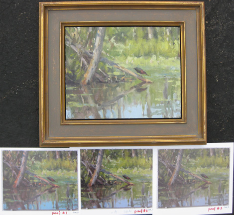
The photos included here help illustrate the tasks, and also reinforce how each monitor and camera differ. You may be able to discern the subtle or not-so-subtle changes in the subsequent proofs. You may or may not agree with my vision.
In all, there will be 120 proofs to match this year. Some will be perfect; others will be nearly perfect; and there will be a few that will make you scratch your head, as I did, when an exact match was not possible.
Know that I did my best. The 2011 Birds in Art catalogue will be available for purchase in September.